
Posted in Experience Design, Software & Development
September 14, 2023
Storybook Best Practices
Our design system is a core piece that makes our decoupled accelerator Gesso so powerful. Learn more in this quick read.
What is Storybook?
Storybook is a tool to develop, document, and visually test our components' user interface or UI. We build modern UIs using components, and Storybook promotes a Component-Driven Development approach. It helps us work on our components, patterns, and layouts in an isolated environment, separated from implementation-specific logic, to ensure their quality from every angle.
It is also the most suitable choice for technically documenting design systems. It serves as the perfect source of truth connecting how designers expect UI components to work and how developers make it work in one place to help teams adopt existing UI standards, making getting something in place relatively quick and easy for both design and engineering.
How is Storybook used?
Packaged as a small, development-only workshop, Storybook lives alongside your app. It is installed by running a command and, during development, runs in a separate node process. If you’re working on UI in isolation, the only thing you’ll need to run is Storybook to browse components and their use cases quickly.
Storybook best practices to create a positive Developer Experience
Storybook Organization
On the Gesso project, we have strived to align our Figma and Storybook as closely as possible in what we call “atomic-ish methodology”. In simple terms, start with your smallest elements (i.e. design tokens) and work your way up to your largest (i.e. fully flushed-out pages).
- Tokens — The smallest parts of the design system, tokens can’t be broken down any smaller, including colours, fonts, borders, radii, etc.
- Components — UI elements and content items created from the tokens: labels, form inputs, buttons, content cards, etc.
- Patterns — Larger, more complex or repeating groups of components: header/footer, product tile grids, checkout forms, for example.
- Layouts — Patterns and components laid out on a page.
- Page — A layout populated with actual content and data.
Naming Stories
Each story should have a title that places the component under one of the above sections in Storybook.
For example, Components/Feedback/Ribbon would equate to the Atomic-ish Design Figma Group/Component Type/Name of the actual component. We prefer to use a single story per component wherever possible, showing the component with all the properties, or props, available as controls. Because of this, the first — and usually only — story is called Default, as it should represent the component as a developer or content creator would receive it in its default form.
What should be in a Story
Set some argument defaults, such as default text, that make the display useful. This helps anyone looking at the component’s story understand what props control what elements.
Every prop available to a component should have a description and a default value where applicable. If users don’t know a prop is available, they may miss opportunities to use the component to its fullest potential.
If a prop requires a full component to be passed to it, provide some examples that can be selected via drop-down or radio buttons.
Check out this article on Controls to learn how to do this.
What shouldn’t be in a Story
Don’t create extra stories for various use cases unless absolutely necessary to demonstrate the component effectively. Storybook should be used for technical examples, with impressive visual showcases reserved for live demo sites. If an extra story is required, consider making a new section called Examples that makes it clear the stories contain more elaborate combinations of components that may include additional features or functionality not received by the default component.
Don’t put other components in the story unless they are directly required. For example, putting Tab and TabContainer in a story makes sense since they work together. But, putting the Ribbon component in a story using Typography does not make sense.
Don’t use extra grids, containers or typography wrappers since this indicates the component has functionality that it does not have. If those are required for it to function, they should probably be built into the component.
Documenting Stories
When creating components in your application, it’s essential to provide clear documentation for how to use and customize them. Storybook is a powerful tool that allows you to create interactive component documentation.
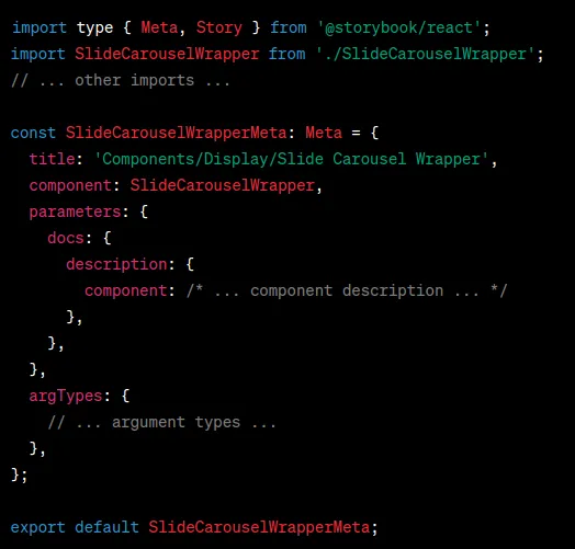
Let’s break down the key components of a Storybook file and how to document your components effectively.
Meta Information

Title and Component
Define a clear title and specify the component that this Storybook file represents. This title will be used in the Storybook sidebar.
Parameters and Description
Provide a comprehensive component description using the ‘docs’ parameter. This description should explain what the component does, its purpose, and its key features. You can use HTML tags for formatting.
Under the description, include a “Material Reference” link if the component is based on a Material component. Provide the same for any other 3rd party libraries the component may be based on.
Arguments and Template

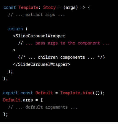
Template and Arguments
Create a ‘Template’ function that takes ‘args’ (the component props) as an argument. Inside the ‘Template”, extract individual arguments from ‘args’ and pass them to the component you’re documenting. This is where you showcase how the component is used and how arguments affect its behaviour. Default.args will make all props available via controls, allowing people to change the look and feel of the component without writing any code. Without args, there are no controls.
Default Story
Create a named export ‘Default’ and bind it to the ‘Template’ function. Define default arguments for the component here. These will be used as the component's initial state when the Storybook story is loaded.
Argument Types

Argument Types
Define argument types and controls using the ‘argTypes’ field. This helps Storybook generate interactive controls for each argument, making it easier for users to experiment with different settings.
The control field should be set appropriately for each prop based on its type. I.e. props that accept a string union could use a radio or select, anything that takes a ReactNode should at least have a text control so that the user can type in text and see where the node is being rendered, booleans should have a default value etc.
Control Order
The control order is determined by the order of the stories Args, NOT argTypes
- Visual/design controls at the top.
- Technical controls such as callbacks in the middle.
- Deprecated controls at the bottom.
Anything that isn’t controlled should be set as undefined so that we can still control the ordering of the args in the docs section as we wish.
Source code should not be handled by dedent or otherwise be created manually. It should always be left to automatic generation.
Controls for deprecated options should be marked as such; there is a deprecateStorybook helper function for this.
The Card story is a good example to follow for best practices if you are unsure.
Conclusion
Effectively documenting your components using Storybook helps other developers understand how to use and customize your components. Clear descriptions, default behaviours, and interactive controls empower users to make informed decisions about project component usage. With a well-documented Storybook, your components become more accessible and user-friendly.
Want to learn more about Gesso, our decoupled accelerator?
Use the form below to request a demo.

